In terms of marketing and target audience recognition, it is important for both my main product and ancillary texts to all link up. This is because - in my opinion - I see my main product and ancillary texts as part of my 'brand', which links to the whole reason as to why they should link up together. When creating a brand, you have an image or 'theme' that is easily recognizable to your audience, so for example, Disney, which is another famous media based brand, have a specific theme and global image that anyone (sometimes people who are not familar with the brand) can easily recognize. Likewise, this is also relevant with food brands such as McDonalds, who have a particular image/theme, so for example McDonald's colours are yellow and red, and they have stuck with them colours since they begun their brand, making them easily recognizable. This theme only becomes recognizable when it is consistent and does not change.
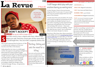
To add on to that, because my main product was a short film, evidently the film review and poster would be part of the overall package and the marketing process, so it simply would not make sense or be effective for the short film to be a horror theme yet the short film and poster to represent a chick flick, thus making them completely juxtopose! Thus, when I was constructing my three products I made sure I kept this mindset, I saw my texts overall as part of my brand and a full package. I made sure that all my texts linked up and the theme was consistent, thus, effective in combining all of them together. The first way I did this was through the use colours, or 'mise-en-scene'. In the images below, I provide screenshots from my short film (and also the actual short film), and my poster and short film review and you can see that I have consistently used the colours red, white (or cream) black and sometimes grey. It is actually hard to find any colour apart from that - apart from the last scene in my short film. The colour scheme of my film review is mainly red, black and white. I did these colours specifically so that my poster, film review and short film could all link up together.

When doing my main product and ancillary texts I had to make sure they all easily linked up, to firstly do this I had to discover I did the main themes of my work, this being innocence, the supernatural and overall death. Innocence came from the use of the child in my short film and how his appearance in my film completely switched the narrative and at that moment the action really started to occur, thus I represented this through white, so the antagonist wearing white (as they prey on the innocent, this also working as a juxtaposition as they are actually evil). The theme of the supernatural comes from my actual antagonist as they are not human! I represented this through the colour black as black has connotations of many things including the darkness, supernatural and also mystery. I showed the colour black simply through low key lighting, specifically the antagonist only being revealed when in the darkness. Finally, I thought of the theme of death simply because that is the unfortunate result at the very end of the short film. As red has connotations of death I represented this through mainly her costume of a red dressing gown, this in a way being a way to foretell her future.
When constructing my film review and poster, the idea of making them have the same colour scheme only came then and also when doing my research. This is because when doing my horror film poster research (which is shown in my research and planning in my film poster work), I discovered that red, white and black are common colours within the posters. As briefly mentioned before, the colour scheme is common because all three colours represent and signify something that links up with horror themes, for example, red has connotations of danger, black has connotations of death and darkness whilst white has connotations of innocence. Linking up to that, within my short film, the colours red, white and black were mainly used in my mise-en-scene (my main character's dressing gown was red and the antagonist's costume was white), therefore, I wanted to carry on this colour scheme within the actual article so that all three of my media texts linked up and it was an extremely accurate representation of all my work, which links to the purpose of film reviews as they are meant to give an overall representation and summary of the film.
Another way I made my three texts an effective combination is by including the 'MMD Productions' within all my pieces of work. MMD Productions is the name of fictional brand and was featured in the beginning of my short film and also within both my poster and film review.
Overall, me doing all of this helped me show and demonstrate the highest level of continuity, thus, overall giving my brand a sense of verisimilitude and professionalism!

No comments:
Post a Comment