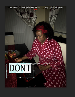
When creating my film poster, the first thing I made sure I did was to make sure that my actual document was in a portrait format, this being because, conventionally, film posters are portrait and not landscape. You could find this out simply by searching up film posters online and this will be clearly demonstrated. The next thing I did was include my background photo, which would be my first layer. My background photo needed to be my first layer as I would be adding more layers on top of it, thus, worked as a foundation layer.
I then started my first layer which would be my tagline/slogan. Tagline's are used in film posters to market and overall advertise. They do this by having catchy, enticing phrases which overall sum up the plot and give an overall representation of the film. I decided to use the slogan "The next scream you might hear may just be your own". I felt like this was effective as a slogan specifically because of the use of direct address, demonstrated in the personal pronoun 'you'. This not only lures the reader in but also includes them, creating questions in the head such as "Why would I be screaming?", this creating an element of fear before the film is even released. This also playing on the fact that my short film is partly a psychological horror as it plays with the audience's mind.
After I had finished writing out the slogan, I decided to make the 'own' in my text a blood red colour. I feel this was effective because it created emphasis to the , this creating synthetic personalisation as the audience at that point would really feel that the poster is being directed at them. This is effective as it persuades them to want to go out and watch the film due to the fact they would be curious as to why they are being involved in this text. The colour red has connotations of danger and death which entertains this idea further on.
After that, I did my film reference: "From the director of Child 27". This is because not only would this reflect real life texts in the sense that film poster usually make references to other popular films that the director had directed to give the audience an idea of what the film is going to be like, but also because it would add a high sense of verisimilitude. I mean this in the sense that for my foundation portfolio I created a film opening to a film called 'Child 27', so this would add a sense of realism as Child 27 is a real life production made by me!
Now when it came to the credits, it was something that I definitely wanted to include cause credits are something that are included in almost every single film poster, not specifically horror film poster. However, creating credits were quite a difficult process. This is because I did not want to copy and paste credits from Google as I wanted to make sure my ancillary texts were as original and authentic as possible. So I decided I would firstly do I test, trial and error credits on Microsoft Word and playing with fonts to see if they could work as credits. I had to do a bit of background research of credits beforehand, such as the general order and structure it goes in and also a good font that I could use to create realistic credits. In the following screenshots you will see the process of me creating the credits before copying and pasting it onto my poster in Photoshop.
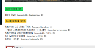
After this, I copy and pasted the text and put onto Photoshop. So at this point I was nearly done but wanted to make extra tweaks as I wasn't fully satisfied. I decided to change the font of my slogan to make it appear more like internet typewriter text as the concept of my short film was based on the idea of the antagonist and protagonist going back and fourth with each other via messages.
Because in my initial idea for my poster I wanted to have my antagonist luring in the background, I decided to see if I could attempt to do that by editing them into the text. This is because when producing my poster the antagonist simply did not work or turn out right which is why I decided not to include or use the idea anymore. So in a last attempt to include an antagonist, and because my antagonist was inspired by the villain in the 'The Ring', I decided to get a transparent picture of the villain and tried to use the magic eraser to remove the white background!
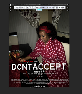
However, this failed! And I decided to just not include the antagonist at all! And down below was my final product!


No comments:
Post a Comment